▪︎ About the company

▪︎ About the project
Overview
Ridely wanted to enhance its onboarding experience to improve user engagement and conversion rates. The goal was to create a seamless, modern, and engaging onboarding flow that would introduce new users to the app’s value while personalizing their experience from the start.
Challenge
The existing onboarding was outdated and not engaging enough. It lacked personalization and failed to guide users toward the key features that would make them stay. Additionally, the upsell strategy for Ridely PRO was not effectively integrated into the onboarding journey.
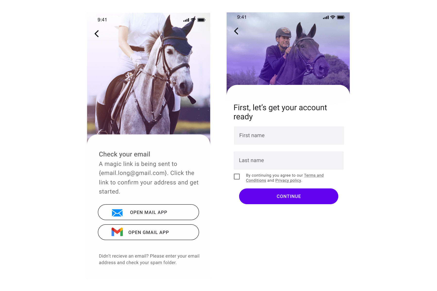
1. Welcome & Introduction
The onboarding starts with a warm, visually engaging welcome screen featuring one of Ridely's most well-known trainers. This instantly establishes credibility and trust, showing users that they will be learning from top professionals. The goal here was to create excitement and highlight the app’s high-quality content.
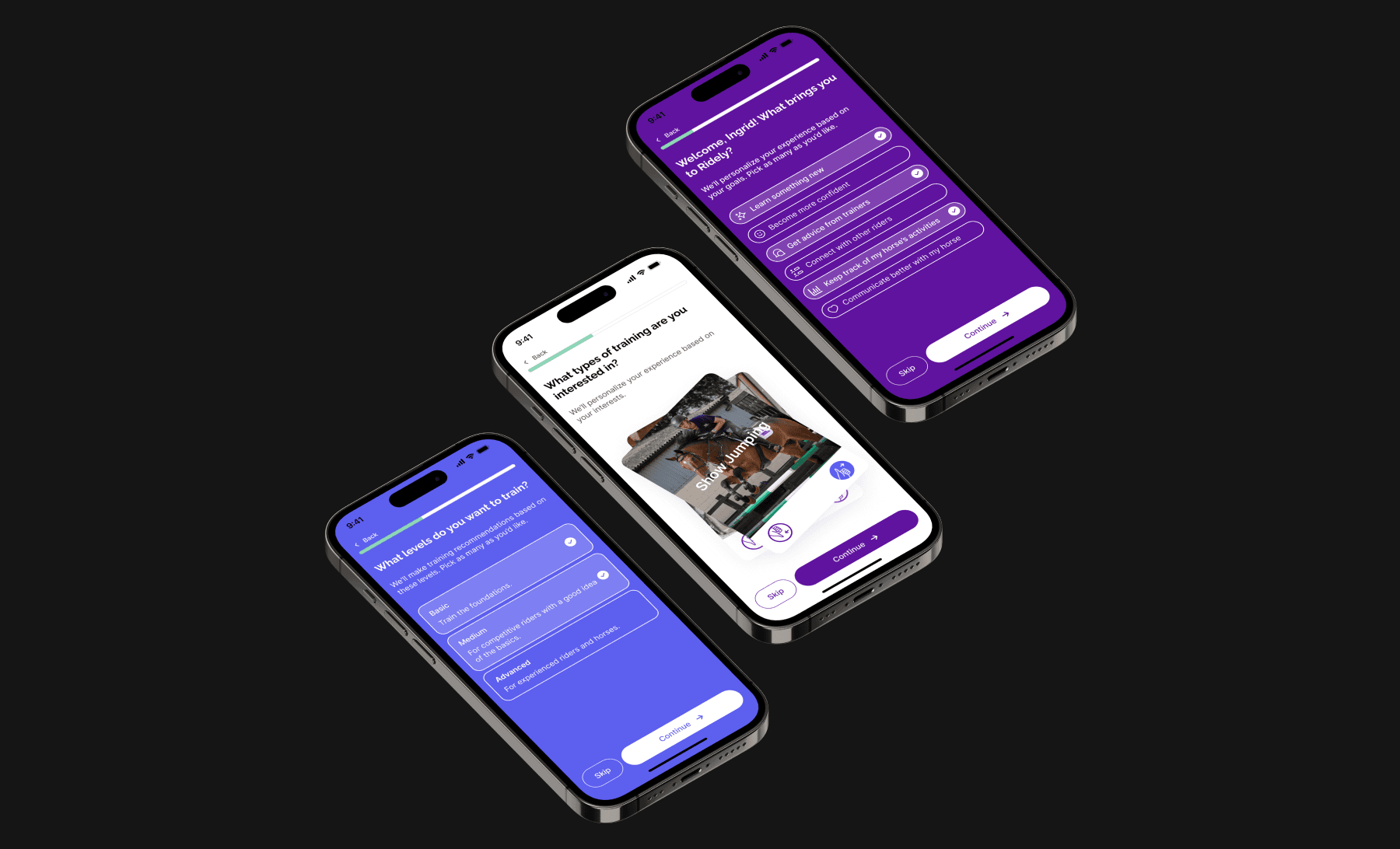
2. Personalization
To tailor the experience, users answer a few quick questions about their riding experience, goals, and interests. This helps customize the app’s initial content, making it more relevant from the start.
3. Feature Highlights
A few informative slides showcase key app features such as training programs, ride tracking, and the community section. The messaging was kept concise and visually dynamic to maintain engagement.
4. Ridely PRO Upsell
At a strategic moment in the flow, users are introduced to Ridely PRO, highlighting its benefits with social proof and clear pricing options. The free trial offer is framed as a valuable opportunity rather than a sales push, making it a natural and enticing next step.
5. Subscription Selection
Users are given a clear choice between different pricing plans, with the yearly plan emphasized as the best value. The design ensures transparency, avoiding any ‘dark patterns’ that could harm trust.
6. Final Confirmation & Entry into the App
Once users make a decision (whether to start a trial or skip), they are smoothly transitioned into the main app with a personalized feed based on their initial responses.


Outcome
Although no A/B testing was conducted post-launch, the new onboarding experience was designed with best practices in UX/UI, ensuring a more engaging and seamless flow. The updated UI aligns with modern design trends, making Ridely’s first impression more compelling and professional.
Key takeaways
Personalization helps increase engagement by making users feel the app is tailored to them.
A well-timed upsell can improve conversions without feeling intrusive.
Clear, modern, and visually appealing UI makes a strong first impression and builds trust.
This project was a great opportunity to merge UI aesthetics with strategic UX decisions, creating an onboarding experience that feels intuitive, engaging, and conversion-friendly.